Pivot tables are an effective tool for quickly summarizing the facts from a mass of records
Pivot Tables and Earthquake Data (Part 3 of 3)
A walkthrough of using Pivot Tables to summarize earthquake data across two dimensions, allowing for even more insightful histograms (Part 3 of 3)
In the first lesson, we learned about the USGS earthquake data and why a map might possibly obscure some interesting insights. In the previous lesson we used basic spreadsheet techniques to create slightly more insightful visualizations. In this final lesson, we learn how to use pivot tables to summarize the data to add an extra, essential layer to our data visualizations.
To refresh your memory, one of our key challenges was to create a histogram of earthquakes-by-state. But using Google's default chart wizard, we didn't have an easy way to only chart states that had a noticeable number of earthquakes. The result was charts like this (only a little exaggerated for effect):
Table of contents
Making a pivot table
In Google Sheets, a pivot table can be created by going to the menubar and clicking Data > Pivot table…. You have the option of selecting the columns and rows that the pivot table is based from. But the best thing to do is just to not select anything specifically. Or to be safe, click the A1 cell before creating the pivot table.
Here's a GIF:

Creating a pivot table creates a new sheet in your current workbook, i.e. a new tab at the bottom (not shown above in the cropped GIF). To switch between your original spreadsheet and pivot table, just use the tabs at the bottom:

This also means you can delete the pivot table without affecting your original spreadsheet. However, deleting the original spreadsheet will obviously affect the pivot table that is based off of it.
Creating rows
The pivot table, when first created, will be empty. So let's add some rows to it.
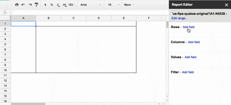
Turn your attention to the Report Editor panel on the right side of the workspace. If you don't see it, click on cell A1 (in the pivot table) to bring it up – the Report Editor tends to auto-hide if the pivot table area isn't in focus:

The Report Editor has several subpanels. The one we care about is Rows.
Click the Add field action. This generates a dropdown menu of all the columns from your original spreadsheet. For now, let's choose STUSPS.
Here's a GIF of the action:
What did "adding a row" based on the STUSPS column accomplish? It tells the pivot table that we want to group each record by its STUSPS value, e.g. CA, IA, and so forth. So the pivot table generates a row for each unique value of STUSPS in the original data spreadsheet.
In effect, selecting an attribute to group by is an easy way to find out exactly what and how many unique values there are in our dataset – which is something we couldn't easily figure out from that ugly pie chart at the beginning of this lesson.
Theoretically, this operation should result in 50 rows, one for each state. As it turns out, only 36 rows show up, which indicates that from 2011 to 2015, only 36 states had earthquakes of M3.0+. Not a bad insight to get right off the bat.
Aggregating values
OK, a list of the STUSPS values is nice, but what we really want is number of records per STUSPS value, i.e. how many earthquakes by state. We do this by adding Values to aggregate by.
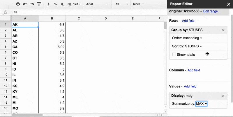
Before we count earthquakes by state, let's do a simple kind of aggregation: find out the highest magnitude of earthquake per state.
To do this, turn your attention to the Report Editor, and look for the Values subpanel.
Click Add field. This time, choose mag as the field. By default, the pivot table will SUM up the values of mag per state, which will tell us the total amount of mag each state has experienced:

This is not particularly important to us. So go back to the Values subpanel, to the sub-subpanel titled "Display: mag". Then click on the little dropdown arrow by SUM. Then, select the MAX option from the dropdown menu.
The result is a more interesting table: the biggest earthquake each state has experienced since 2011.
Here's an animated GIF of adding the mag column and finding its MAX value:

Sorting by aggregate
To make the biggest earthquake by state insight even more convenient to see, let's sort the rows of the pivot table by the MAX mag value, i.e. the newly-generated second column.
By default, the pivot table's rows are sorted by the value of the rows, i.e. alphabetical order of STUSPS. To change this, go to the Report Editor's Rows subpanel, then the Group by: STUSPS sub-subpanel.
Then, change the options like so:
- Order: Descending
- Sort by:
MAXofmag
Here's a GIF:
Doing a group count of records
OK, let's think how this relates to our original problem: we want to compare the number of earthquakes by state, but only for the states that have actually had a significant number of earthquakes. Well, we now know how to summarize the earthquake data by STUSPS, and then how to sort by the summary values, i.e. to find the top maximum mag values per state.
Now, instead of MAX of mag as the summary, we want to just get a count of records per state.
In the Report Editor, in the Values subpanel, go ahead and click the little X to remove the "Display: mag" box. Then, click Add field for Values.
To get a count of records, it actually doesn't matter which column you choose here. But to make that obvious, choose the id field, which is just a string of characters used by the USGS to refer to each earthquake. It's obviously not a value that you can calculate a meaningful MAX or SUM of.
Again, the default aggregate function will be SUM, which results in 0 for every row. Click the Summarize by dropdown and select COUNTA.
Now we have a list of earthquakes by state since 2011:

Making histograms the manual way
Let's take a step back to realize something: remember in the last lesson, how we were able to create histograms by simply highlighting an entire column and telling Google to make us a chart? Here's what happened when we made a categorical histogram by STUSPS:
Note how the y-values of each bar corresponds to the summary counts in our pivot table. So basically, in the previous lesson, the Google Chart Editor did this summary-count for us. Which is nice, when that's exactly what you want…but it's nice to know how to do a summary count for ourselves.
To create a histogram from this pivot table is not difficult; the pivot table you just made looks just like a spreadsheet, right? Because it basically is a spreadsheet (though not one that's editable), which means, making a chart from the data is pretty much the same thing.
Prove this to yourself by selecting the A1 cell (so that the Google Chart Editor assumes you want a chart based on the entire pivot table). Then, selecting Insert > Chart… from the menubar.
Then, instead of choosing a recommended chart, click the Chart Types tab, scroll down, and select one of the Column charts. The result should be something that looks like our previous earthquakes-by-state histogram, warts and all:

Selectively charting data
OK, so now that we can more manually create a histogram, what does that mean? Well, now we have more flexibility in creating the histogram. Remember that the default histogram was, in theory, what we needed. But it couldn't fit all of the possible states, which it arranged on the x-axis in alphabetical order.
So the first step is to sort the rows by "COUNTA of id" in Descending order, and we now have a ranking of states by total number of M3.0+ earthquakes since 2011:

We could now create the histogram as before. But let's not use all of the data. Highlight the first 10 rows of the data, then create the chart. Here's an animated GIF:

And the resulting chart:
Quick tip: After creating the chart and inserting it into your spreadsheet, click the little dropdown arrow on the top-right of the chart. There should be an option to move the chart to its own spreadsheet, if that makes it easier to see things.
Take a minute to practice
For practice, try repeating the histograms from the previous lesson, such as earthquakes by year or by year-month. The charts you make shouldn't be substantially different from before, but just make sure you fully understand the ideas of grouping and summarizing by rows with pivot tables.
Adding a column to summarize by
Summarizing data by grouped row is very useful in itself. So what more is there? Scroll back up and take a look at that top 10 state histogram: did it surprise you that Oklahoma has more earthquakes than famously-quake-prone California?
Has that always been the case? Maybe we're ignorant of that because people just like to talk more about California than Oklahoma?
But let's find out for sure. To answer that question – has Oklahoma always been more seismically active than California? – we need to know not just how many earthquakes happened in a state, but when.
We obviously can find that via the time and year attributes. But how? By creating a second level of aggregation: number of earthquakes by state and by year.
So assuming your pivot table is where we previously left it, turn your attention to the Columns subpanel in the Report Editor.
Click Add field, then select the year column (which you should have created via formula in the previous lesson). Since we already have "Summarize by: COUNTA" as a Value field, we get the breakdown by state and year that we wanted:

Creating a multi-series visualization
Selectively highlight the first 10 rows again (ignore the Grand Total column) and create a chart from it. Without too much work, you should get something like this:
Earthquakes by state and by era
Remember that era column we created in the previous lesson? Now that we're not simply counting earthquakes by era, but earthquakes by era and by state…maybe a different picture will come up? Alter the pivot table to perform this aggregation. You should get a chart (with some customization effort) that looks like this:
Oklahoma just became a lot more interesting…
More to come…
References
A short overview of the importance of spreadsheets
A walkthrough of basic spreadsheet and pivot table usage (Part 1 of 3) We have a lot of ways to easily create beautiful, elaborate visualizations. But let’s see what we can do when we prioritize the story of the data over its visual presentation.
A walkthrough of managing earthquake data and doing basic visualizations with spreadsheets (Part 2 of 3)