A walkthrough of managing earthquake data and doing basic visualizations with spreadsheets (Part 2 of 3)
How (and why) to use a spreadsheet to turn a beautiful interactive earthquake map of into a bar chart
A walkthrough of basic spreadsheet and pivot table usage
(Part 1 of 3)
We have a lot of ways to easily create beautiful, elaborate visualizations. But let's see what we can do when we prioritize the story of the data over its visual presentation.
Quick summary: This three-part lesson covers virtually everything I hope you learn about spreadsheets (Part 2), pivot tables (Part 3), and the value of summarization and filtering data. There will be an intimidating array of charts, and numerous steps describing how to make those charts.
But those are just the details. Our main takeaway will be: how do we find stories in data?
Part 1 of this lesson – what you're currently reading – describes the data we use and how to get it: 5 years worth of earthquake records for the United States. It is nowhere near "big" data, but big enough that its insights are buried in a wall of (delimited) text:

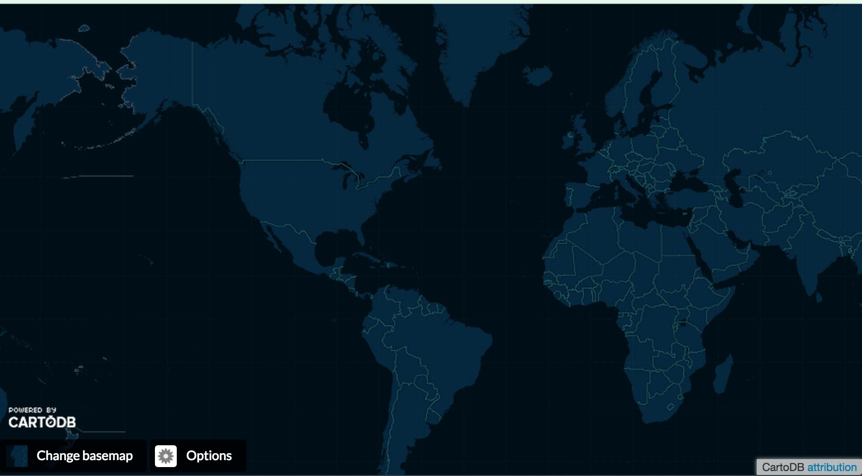
So when we talk about finding stories in data, the core challenge is basically to make something readable out of a visually unreadable dump of text. In Part 1 of this lesson, we learn how to turn that text into a beautiful interactive map, such as this CartoDB torque map:
It took me literally 5 minutes to make this map. That includes remembering about the CartoDB service, then creating an account, confirming my account, uploading the data, and using the map wizard. I didn't even have to read their great tutorials.
But even before thinking about what we can do with the data, I want this lesson to show that we should first think about what we can find in the data. In other words, what are the important stories we can find in data? And how do we find those stories?
Just give me that data and map!
Here are the important data links before you dive into the wall of text that is this lesson.
- The CSV of 2011 to 2015 earthquakes as collected from the United States Geological Survey: usgs-us-with-fips-quakes.csv. It contains more than 5,500 records for all earthquakes within the boundaries of the United States that were of magnitude 3.0 or more.
- The CartoDB torque map made from the USGS data: The public view of the map, which also links to a data table that contains the data from the aforementioned CSV.
- All the answers to this tutorial, as a Google spreadsheet: The spreadsheets, pivot tables, and charts created in this 3-part-tutorial are available in this massive Google Sheet.
However, there's not much fun in just copying my work. So just start from the original CSV: usgs-us-with-fips-quakes.csv.
If you want to jump straight to the spreadsheeting, that starts in Part 2. Otherwise, read on for some quick thoughts about maps and more details about the United States Geological Survey's earthquake data.
Table of contents
What's in the USGS data?
Too much information...?
Reading this section is not necessary for doing this exercise. I provide it as context. The most important part is understanding how I’ve modified the data to include United States specific information, which will become important when we learn about spatial data joins via QGIS (here’s a great tutorial by Michael Corey to tide you over).
Otherwise, feel free to skip to the section Why Make a Map?
The United States Geological Survey (USGS) offers downloadable historical earthquake data via its Earthquake Hazards archive and real-time feeds.
For this exercise, we will be using comma-delimited data (CSV format) from the archive, but you can get a snapshot of what it looks like by visiting the USGS landing page for its real-time CSV data. On that page is a list of the fields, of which these are the most relevant to us:
time: the time of an earthquake event, in Coordinated Universal Time and formatted as ISO-8601:2015-10-04T05:04:09Zlatitudeandlongitude: the coordinates for the earthquake event.place: a vague but human-readable description of the earthquake's location, e.g."Southern Alaska"and"36km WNW of La Belleza, Colombia"mag: a decimal number, typically in the range of -1 to 10, representing the relative size of an earthquake. This actually isn't terribly important for this exercise but is a number that is common to think about when it comes to earthquakes.
Getting the USGS data for yourself
Quick reminder: Here's my data
The data for this exercise is here: usgs-us-with-fips-quakes.csv. But I have modified and augmented it in very important ways, which I detail later.
The USGS earthquake archive provides a web form for data access:
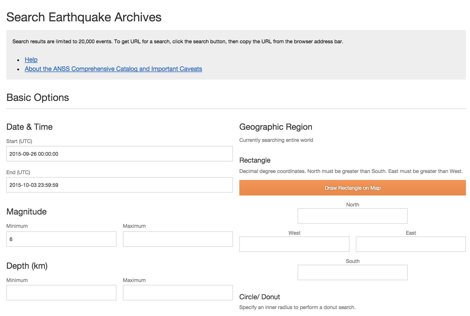
The most relevant input fields are Date & Time, Magnitude, and Output Options.
Output options
This should be set to CSV. The default option, Map and list, will produce, well, a map and list:
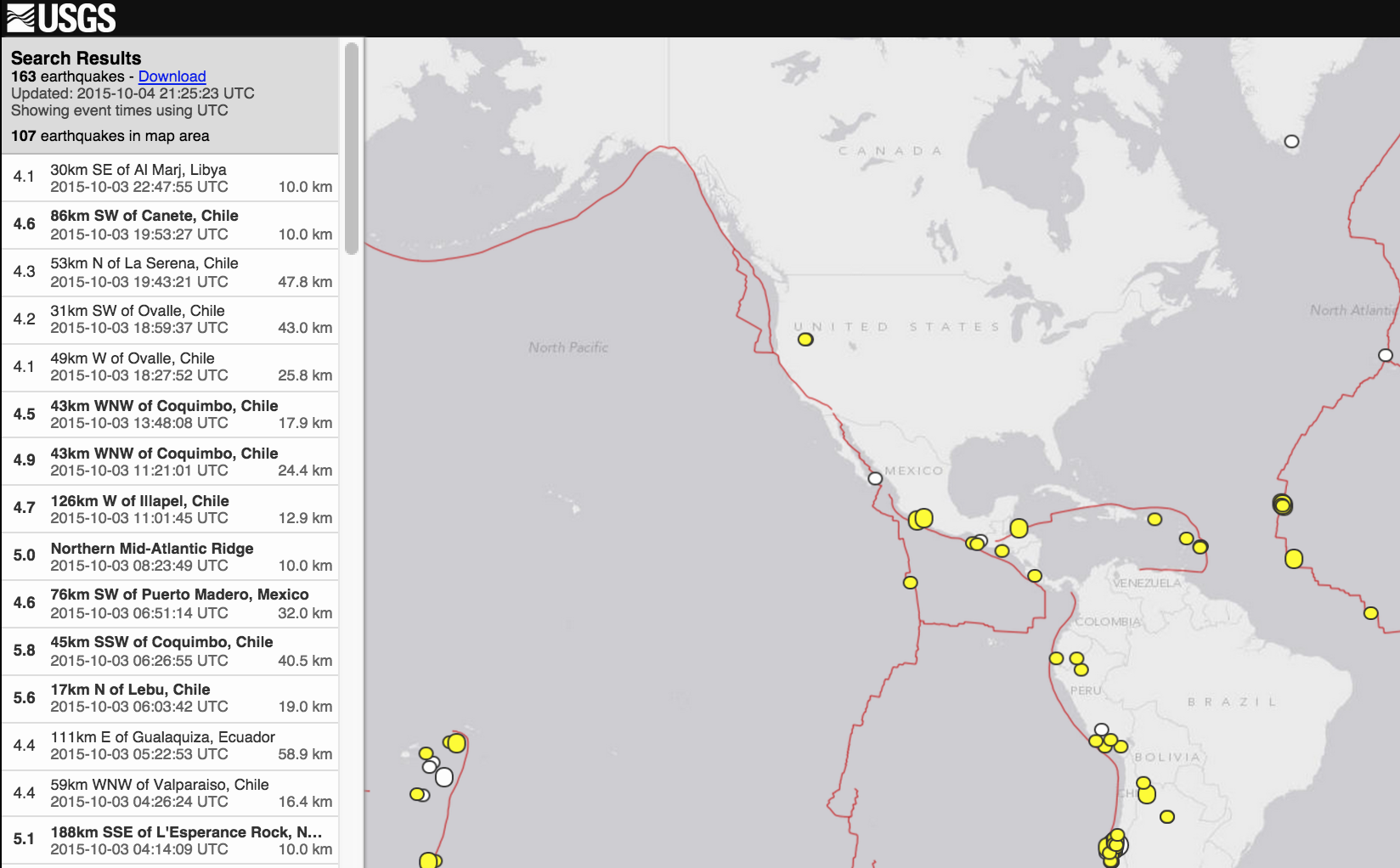
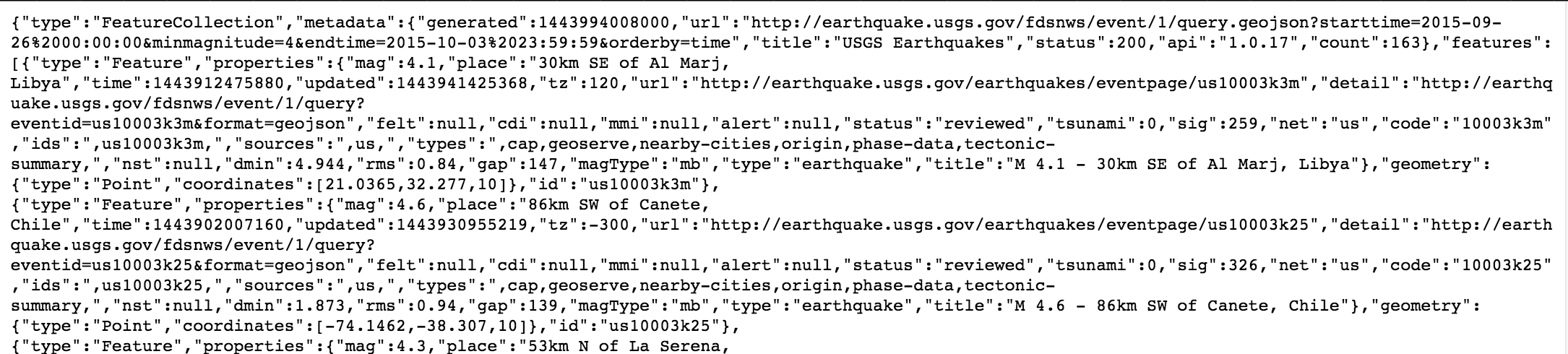
This is nice, but not helpful if we want to do our own data analysis. The other formats, such as GeoJSON, are definitely useful, but only if you know enough programming to work with JSON efficiently. The raw GeoJSON looks like this:
The CSV output is not much prettier to human eyes:

But it's something that can be easily imported into a spreadsheet, which is good enough for us:

Magnitude
I suggest setting the minimum of the magnitude to at least 3. The number of all earthquakes worldwide, in the last 30 days, can range near 10,000, with 80 to 90 percent having a magnitude less than M3.0. If you want to verify this for yourself, visit the USGS real-time feeds page and download the "Past 30 Days: All Earthquakes" file (or just click this link).
Is it worth counting earthquakes that have about as much perceivable force to humans as a car driving by? Probably not, if you aren't professionally studying geology. For our purposes, including weaker-than-M3.0+ earthquakes involves downloading a much bigger dataset.
The big reason for our purposes is that the USGS archive will return a maximum of 20,000 records at a time. Trying to do a very large query, such as all earthquakes in the last 5 years, regardless of magnitude, will result in an error message:
  Error 400: Bad Request

  344492 matching events exceeds search limit of 20000. Modify the search to match fewer events.

  Usage details are available from http://earthquake.usgs.gov/fdsnws/event/1

  Request:
  /fdsnws/event/1/query.csv?starttime=2011-01-01%2000:00:00

  Request Submitted:
  2015-10-04T21:37:49+00:00

  Service version:
  1.0.17
So including weak earthquakes means having to fiddle with the Limit Results input fields and downloading multiple batches, which is a bit of an inconvenience.
Date & Time
Even though we can set the start time of our query to the entire last century, earthquake-detection capabilities has changed over time. You can read the caveats and details about the USGS data here. Keeping in mind the 20,000-record-per-request limit, I think it's best to query within the last 20 years.
The USGS does not have an international seismic sensor array as complete as its United States network. In fact, its (outdated) statistics page says:
Starting in January 2009, the USGS National Earthquake Information Center no longer locates earthquakes smaller than magnitude 4.5 outside the United States, unless we receive specific information that the earthquake was felt or caused damage.
Although the USGS archive includes data from international networks, it's safe to assume that the historical number of records for weak earthquakes is a bit nebulous.
Geographic Region
The USGS search form provides a handy interactive tool for specifying a region to request data for:
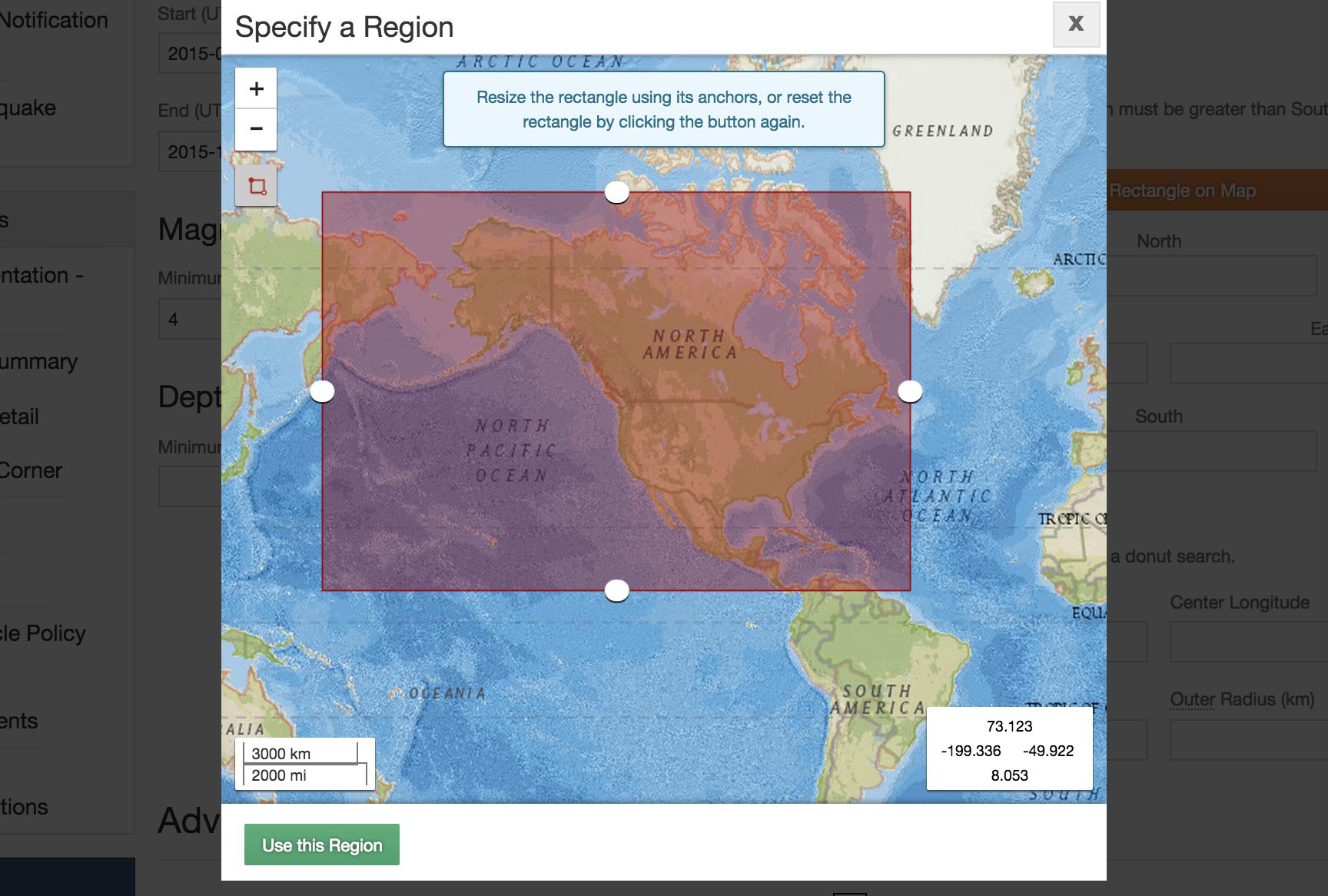
As you can see, my attempt to specify all of the United States, including Alaska, results in a bounding box that will include earthquakes from parts of Canada, Mexico, and Russia.
Why can't we just specify a region by name, such as "the United States"? Because that's not how the USGS categorizes earthquakes. More on that later.
Practice your cURLing
If you don't know anything about curl or using the command-line, you can skip this part.
However, if you do know curl, and you know a bit about your browser's network inspection panel, you can see how the GET requests behind the USGS form. If you don't feel like fiddling around with buttons and inputs, here's the curl request needed to get data for M3.0+ North American earthquakes since 2011 through September 2015:
usgs_url='http://earthquake.usgs.gov/fdsnws/event/1/query.csv?starttime=2011-01-01%2000:00:00&maxlatitude=72.396&minlatitude=5.616&maxlongitude=-44.297&minlongitude=-197.578&minmagnitude=3&endtime=2015-09-20%2023:59:59&orderby=time&limit=20000&offset='
curl --compressed "${usgs_url}1" -o data/usgs-north-america-quakes.csv
curl --compressed "${usgs_url}20001" | tail -n +2 >> data/usgs-north-america-quakes.csv
The result of those two GET requests can be found in my stashed copy here: usgs-north-america-quakes.csv
How to get USGS data by U.S. state
In the dataset I provide for this exercise – usgs-us-with-fips-quakes.csv – contains 5,537 records of M3.0+ earthquakes since 2011 that have occurred within the borders of the United States. I extracted this subset of data from the standard USGS data, in which I drew a bounding box around all of North America. This data – which you can see here: usgs-north-america-quakes.csv – contains 23,347 records, i.e earthquakes that happened in Canada, or the ocean.
Remember that the USGS data includes only a place field, which contains a vague, human-readable description such as "Southern Alaska" and "36km WNW of La Belleza, Colombia".
So how did I get filter the data to include only earthquakes within the United States when the USGS doesn't provide a way to filter the data by political boundaries?
By cross-referencing the latitude and longitude data with U.S. Census boundary data. So…OK, how did I do that? That's a topic for a much later tutorial on QGIS (check out Michael Corey's QGIS tutorial for NICAR: Manipulating and editing geographic data with QGIS).
The upshot is that the usgs-us-with-fips-quakes.csv file, besides being a filtered subset of data, contains two fields that I've added: STUSPS and FIPS:
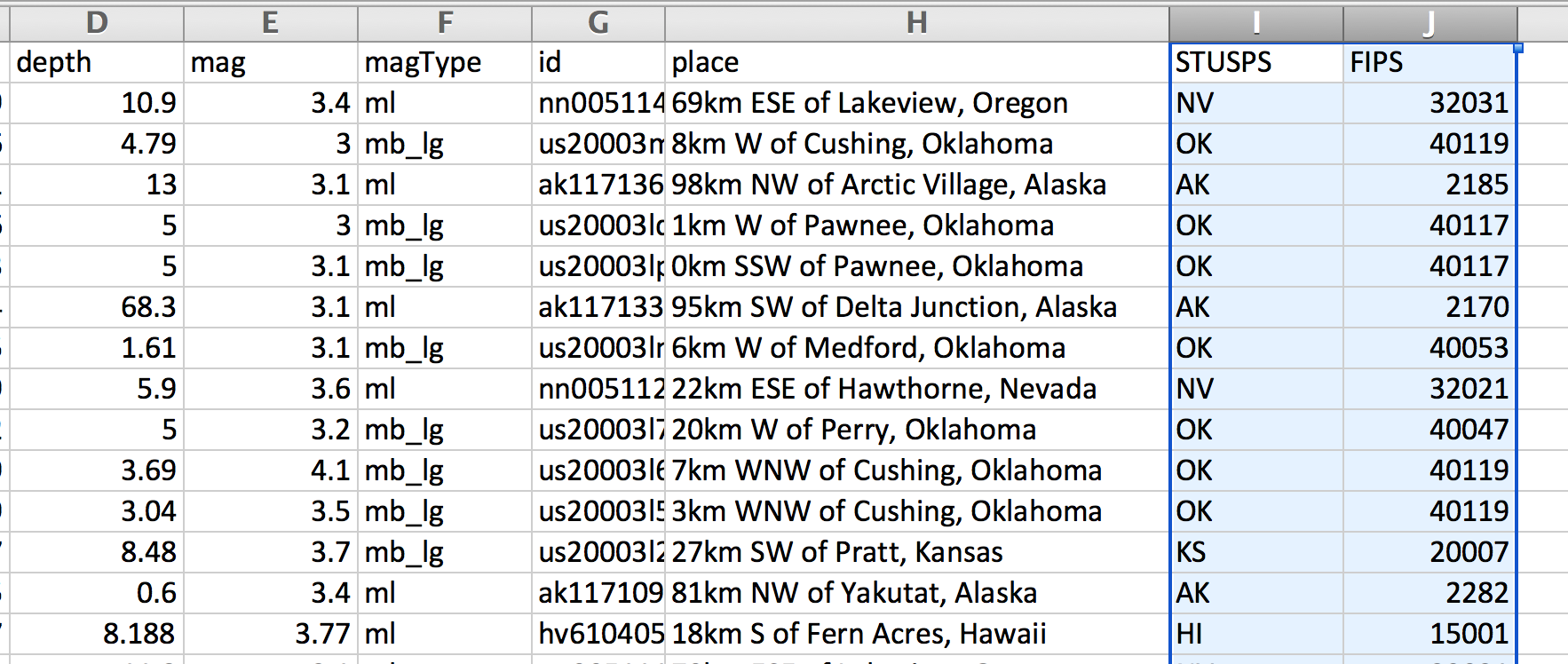
STUSPS stands for United States Postal Code – e.g. AK and NY – and FIPS is the federal code designated for each United States county, e.g. 06075 for San Francisco county.
How does this differ from the USGS's place field? Take a look at the record for this Sept. 20, 2015 earthquake with an id of nn00511445.
Its place value is: 69km ESE of Lakeview, Oregon
On a locator map, it looks like this:

However, its STUSPS value is NV, i.e. the state of Nevada, and its FIPS is 32031, i.e. Washoe County, Nevada.
Why doesn't the USGS provide country or state level data?
Obviously, the USGS could categorize earthquakes by political boundaries, but it chooses to go with place labels. In our previous example, why does the USGS choose to use 69km ESE of Lakeview, Oregon? Maybe because Lakeview, Oregon is the most significant municipality near the earthquake, and thus, describing the earthquake relative to Lakeview is more useful than, "Somewhere in Washoe County".
But in general, think about the nature of earthquakes. They don't abide by our human-made geopolitical boundaries. If California is hit by numerous earthquakes, it's not because of something related to California, the political entity, but the fact that California has a lot of active fault lines. So geologists don't care so much about where an earthquake occurs relative to state lines. They care about earthquakes relative to fault lines.
So why care about earthquakes at U.S. state-level?
OK, so what's the purpose of including the STUSPS and FIPS fields? If nothing else, it's a convenient way of categorizing earthquakes; "California had 25 earthquakes in the last month" is more understandable to the average person than "There were 25 earthquakes within the Hayward-Rodgers Creek Fault region in the last month".
But even if earthquakes are generally the result of geological characteristics, there are reasons to quantify earthquakes in terms of human-made geopolitical boundaries. For example, if a massive earthquake were to strike Kansas City, near the split between the Missouri and Kansas state lines, the damage done on a human-scale might be more greatly affected by state boundaries rather than physical distance to the earthquake.
How? Think about how building codes differ between states, cities, and counties.
But what if state-regulated human activity caused earthquakes? Then using the STUSPS field would be very helpful, at least to quantify the correlation.
In the next section, I go over some examples of map visualization, which rely completely on the latitude and longitude fields of the earthquake data. However, parts 2 and 3 of this tutorial rely completely on the STUSPS and FIPS fields, and by doing so, reveal a more interesting story about a recent trend in U.S.-based earthquake activity.
Why a map?
When our data includes geospatial coordinates, i.e. latitude and longitude, a map seems like the obvious choice. With mapping software – in this case, CartoDB – we don't even have to supply any data and we already have a visual more lovely and sophisticated-looking than just about anything we could create from a typical spreadsheet:
The problems of overplotting
But the primary strength of its map is also its primary limitation. Think of a map as a scatterplot with longitude on the x-axis and latitude on the y-axis. A lot of the ink of this "chart" is devoted to showing us Earth's land masses and bodies of water, even before we add any of our data.
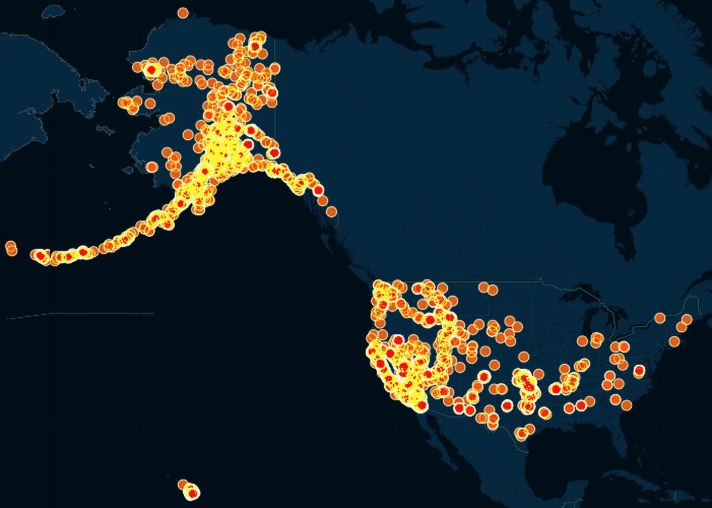
Here's what the earthquake data looks like if we don't try to plot it by time:
Because there are so many earthquakes, this turns out to be a gigantic clutterfest:
The third dimension
The first two dimensions of our graph – the x- and y-axes – are taken up by longitude and latitude, respectively. To visually represent a third attribute, i.e. dimension, of the earthquake data, we can vary either the color or the size of each dot.
- Note 1: Obviously, we could vary both the size and the color of each dot. I don't know how to do that easily with CartoDB, but even if we could, it's not helpful for our current dataset (as we'll soon see). And in most real-world datasets, it can result in a bit of visual overload.
- Note 2: Obviously, when we normally think of three dimensions, we think of things sticking out of the "page", i.e. having depth. It is tricky to use depth to illustrate data on a flat surface, to say the least.
We'll deal with those pitfalls of visualization in a later lesson. For now, let's just see what happens when we can use size or color to depict either the year or the magnitude of each earthquake.
Depicting magnitude with size
Let's use the to show the mag value of each earthquake and visually represent the z-axis by size. In other words, the bigger the magnitude, the bigger the dot:
It's not a bad strategy but in this specific dataset, it's not helpful because, besides the problem of having 5,500+ dots, it turns out that the vast majority of these earthquakes are between magnitudes of 3 to 4. A map is profoundly unhelpful for showing that kind of breakdown.
Depicting year of earthquake with color
Let's use each dot's color to indicate what year the given earthquake happened. Quick note: the USGS data doesn't have a year column, but I did some work in CartoDB's SQL editor to derive year from the time column. The exact steps don't matter as we'll learn how (and why) to do it in a spreadsheet.
Again, not a bad tactic, but we still have the problem of more than 5,500+ dots to show.
Bins and clusters
The sheer number of data points is our main obstacle to understanding the data. One solution is to simply remove the number of data points by grouping them together with other like data points. This concept is often referred to as clustering.
CartoDB actually has a map type named Cluster, in which nearby points are grouped together into a bigger point:
By clustering – that is, aggregating points based on their latitude and longitude into a single "glob" – we sacrifice granularity to gain a clearer overview of the data. This is a technique applies to more than map visualizations, though. In the Parts 2 and 3 of this lesson, we will create bar graphs by "clustering" the earthquake records, but not according to their latitudes and longitudes.
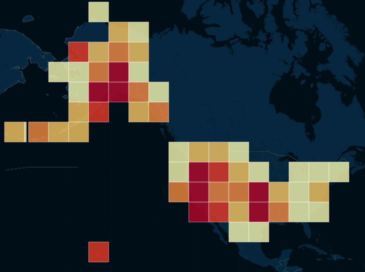
Rectangular binning
The term binning is sometimes used to refer to the aggregating/clustering of points. In the screenshot below, the CartoDB earthquake data is grouped into square-shaped bins. The more points that fall into each square bin, the darker the color of that bin:
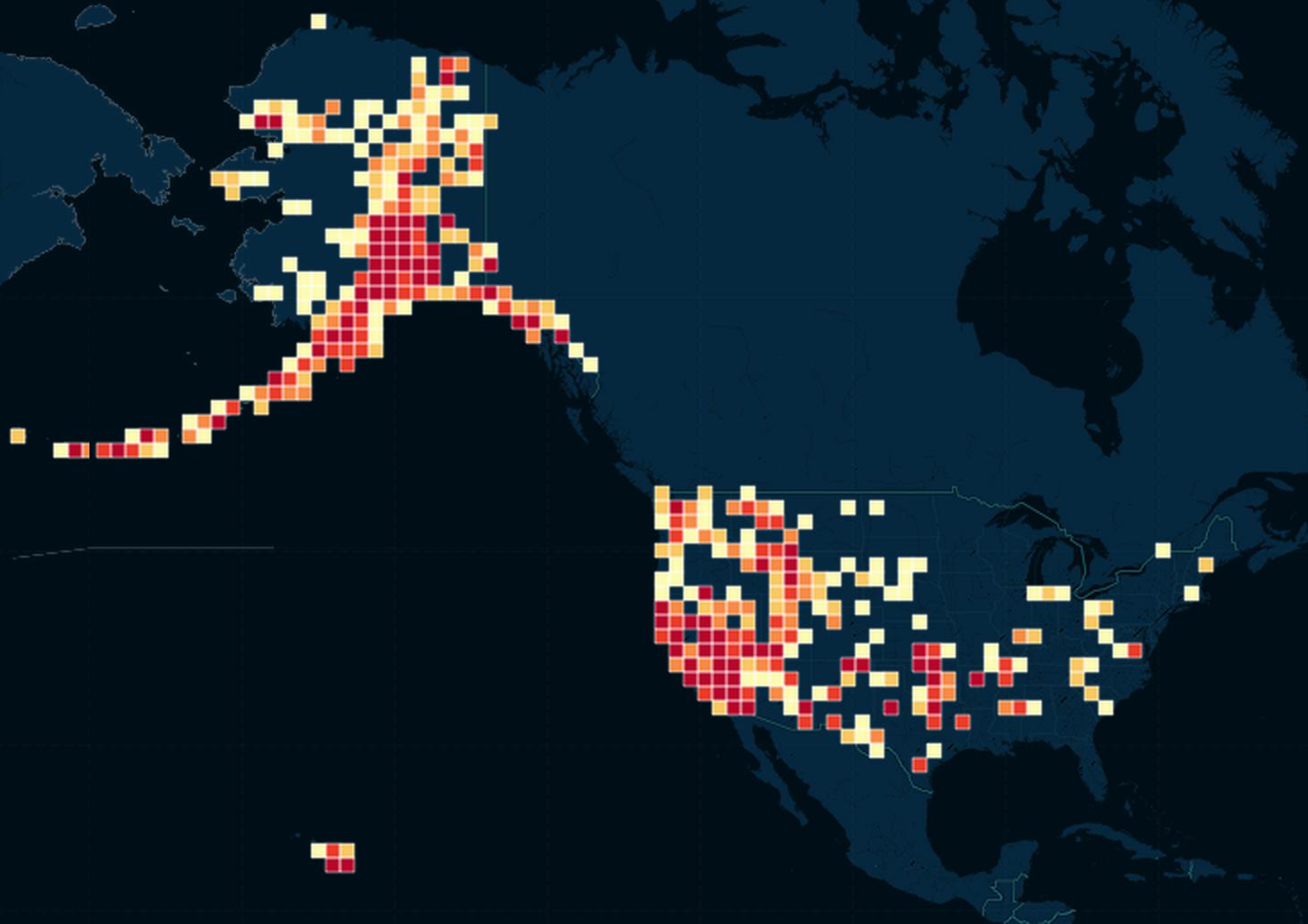
Choosing the size of the bin can drastically change the visualization. Here, the bins are cartoonishly large, painting a picture so broad that we can't even see California as a earthquake-dense state:
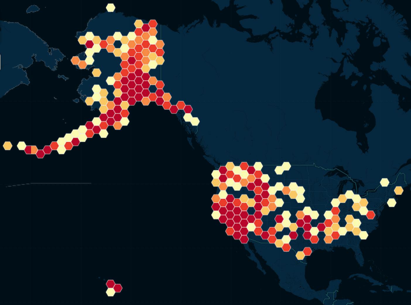
Hexbinning
This is basically the same concept as rectangular binning. But besides having a less "boring" look, hexagons have the advantage of being more circular-like, i.e. points on its edges and corners are more equidistant to the center than are the edges and corners of squares:
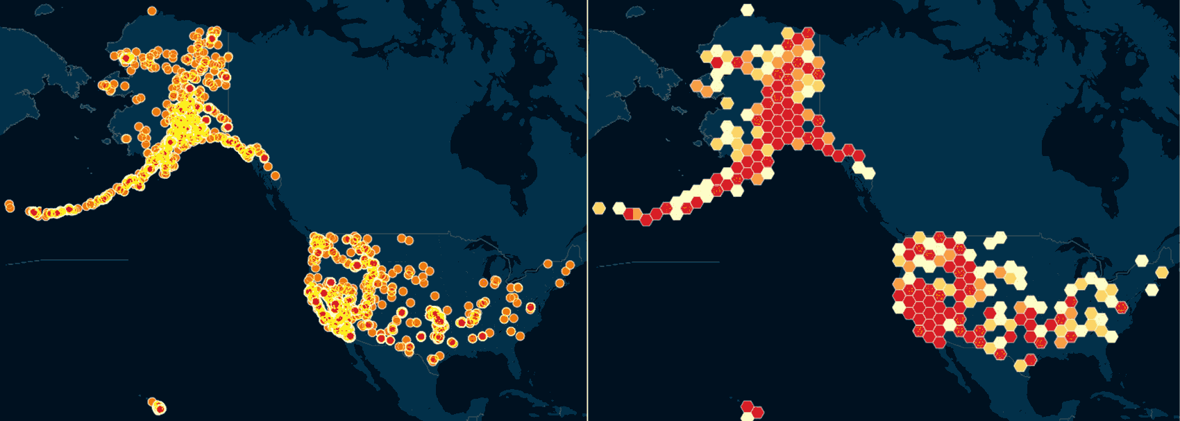
Whether you prefer hexagons, squares, or bubbles, again, our main goal is to reduce the visual clutter caused by 5,500+ records. Here's a side-by-side comparison of the original one-dot-for-every-earthquake scatterplot versus the same data, but hexbinned:
Visualizing time with animation
Visualization software like CartoDB's torque map allow for another kind of axis of visualization: time. That is, the chart changes over time – i.e. the time that is physically passes for the viewer.
So basically, animation. Here's the intro chart again:
So beautiful. And virtually no effort on my part.
Why not an animated map?
First of all, this is not a substantiated critique of CartoDB or other mapping software. I have literally put the least amount of effort possible into using their software. A lengthier discussion on the limitations of maps in general will be saved for another lesson. But Matthew Ericson, a graphics director at the New York Times, said it better than I can with: When Maps Shouldn’t Be Maps
But let's pretend that it is difficult to make a more useful visualization after more sophisticated usage of mapping software – what can we do better without a map?
Missing the state-by-state story
So why does an animated map fail in our situation?
The better question to ask is: what story is told by this time-lapse map?
Or, to state it in a viral-news way:
THESE TWO CHARTS PROVE WHY ANIMATED MAPS DON'T ALWAYS WORK
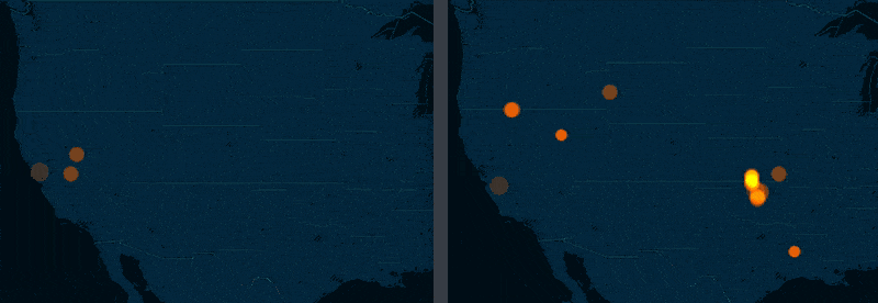
January 2011

January 2015
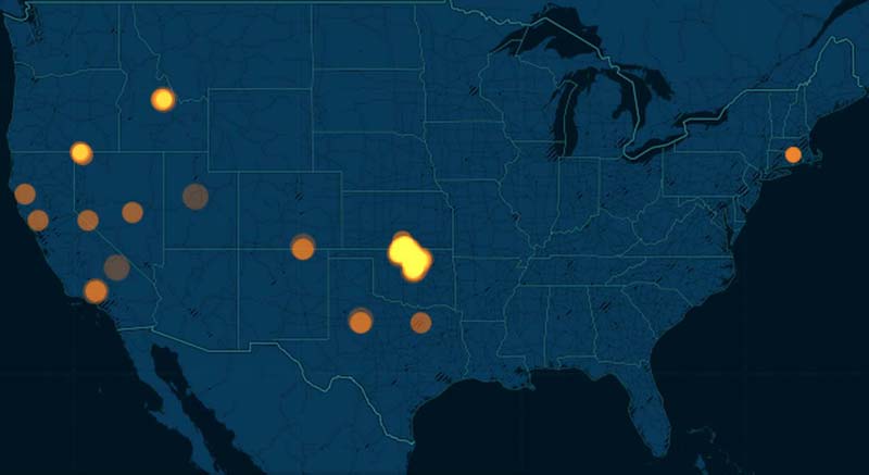
The story of Oklahoma
The big story of the 2011 to 2015 M3.0+ USGS earthquake data is that the state of Oklahoma, once relatively dormant, is now just recently a hotbed of seismic activity. If the side-by-side screenshots above weren't enough, here's a side-by-side comparison of torque maps for 2011 versus 2014 (roughly):
The New Yorker and NPR have extensively covered Oklahoma's recent earthquake binge and I highly recommend reading their coverage.
But for this exercise, let's pretend we have yet to discover Oklahoma as an outlier. With maps, we can most definitely notice the trend – but only because it is so dramatic. And we can't quite quantify with a map alone.
In the next part of this lesson, we'll move away from maps and to the humble spreadsheet and bar chart and explore the earthquake data. It will take a little more work initially, but the concepts will be applicable for all kinds of data, not just geospatial data. And we'll get a clearer picture of Oklahoma's earthquakes.
Continue on to part 2 of this tutorial.
References
A walkthrough of using Pivot Tables to summarize earthquake data across two dimensions, allowing for even more insightful histograms (Part 3 of 3)
Pivot tables are an effective tool for quickly summarizing the facts from a mass of records
Manipulating and editing geographic data with QGIS, by Michael Corey | mikejcorey.github.io
We’ll learn QGIS in another tutorial. But if you’re curious how to do a spatial join, Michael Corey demonstrates how QGIS while also using the USGS earthquake data.
Weather Underground: The Arrival of Man-Made Earthquakes | newyorker.com
Exploring the Link Between Earthquakes and Oil and Gas Disposal Wells | stateimpact.npr.org