Basic Aggregation with Pivot Tables
Note: This tutorial was ported over from the 2014 padjo tutorials page.
Welcome to this quick introduction to using pivot tables for data analysis, in which we'll learn how to use Google Spreadsheets to quickly summarize a large, granular dataset.
Download the dataset for this lesson: SFPD Incident Reports Categorized as DUIs, Drunkenness, or Kidnappings, from 2003 to 2013.
The above dataset was extracted from data.sfgov.org.
This dataset contains more than 15,000 records: it consists of all the San Francisco Police Department crime reports that have a category field of:
DRIVING UNDER THE INFLUENCEDRUNKENNESS- and for good measure,
KIDNAPPING
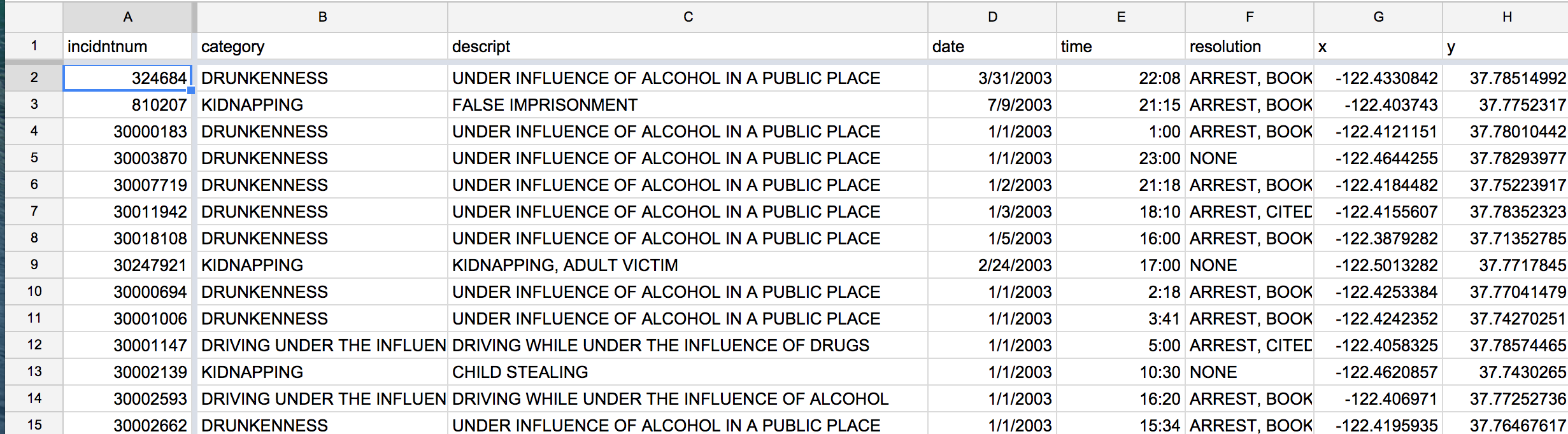
Here's a screenshot of what it looks like:
15,000 records is good and all, but with the raw data, we aren't able to know some basic characteristics of the data…for example, how many of these 15,000 records involved, say, just KIDNAPPING? And have the number of kidnappings gone down over the years? To know that, we need a way to count these records by category and by year.
This is where Pivot Tables comes in. It provides an easy point-and-click interface to quickly summarize and explore your very granular data.
Summarize by category
So first question: How many crime reports are in each category? This is a summarization of the data, specifically, a counting of records based on their category value.
Here are the steps to follow:
-
Click on Data -> Pivot table report…. This creates a new sheet, and you switch back and forth between it and your original data sheet.
To view this video please enable JavaScript, and consider upgrading to a web browser that supports HTML5 video
</video>
-
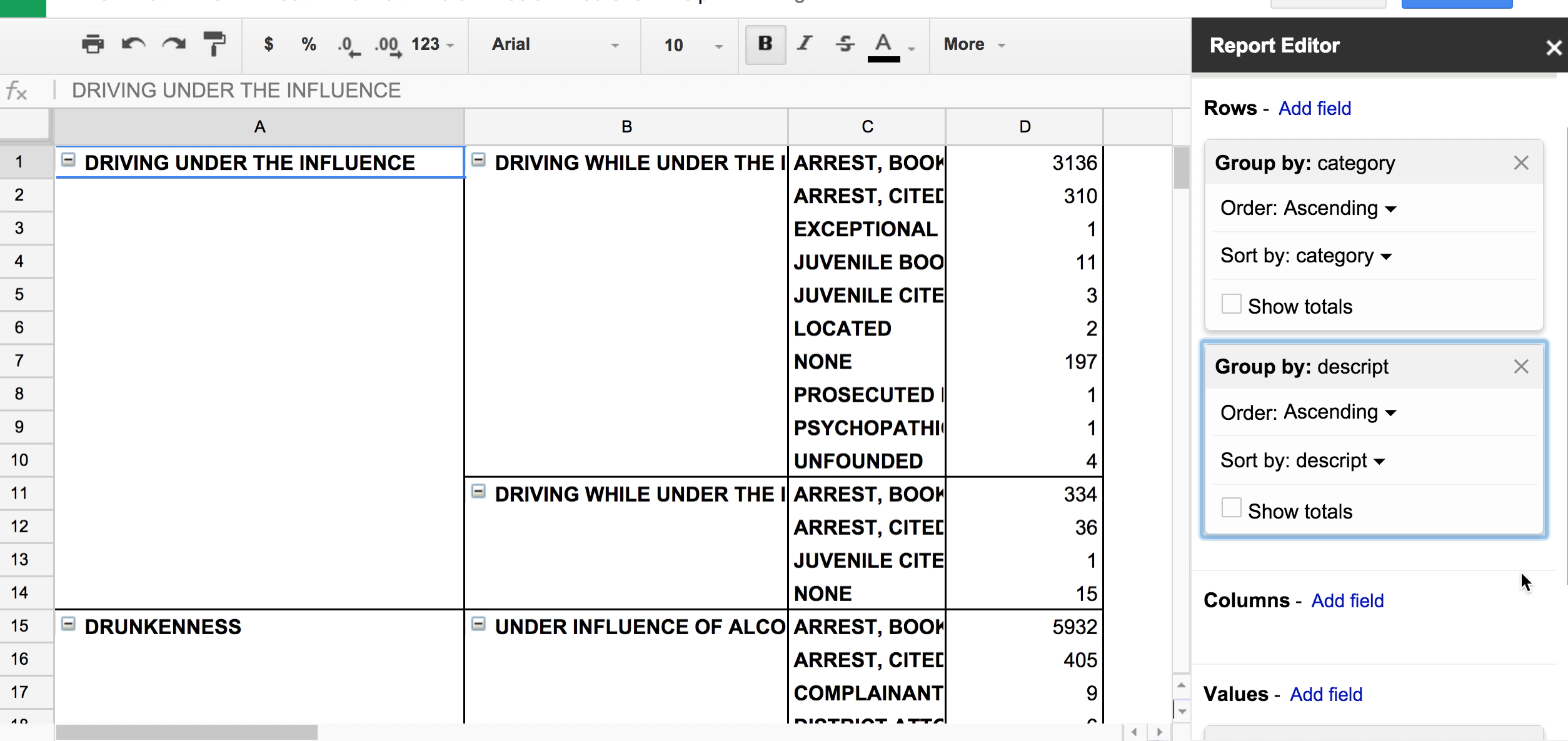
In the Report Editor, click Add field in the Rows section. Choose
category; this will group your records by thecategoryfield.The effect of this is that the pivot table will have one row for each value – e.g. "
KIDNAPPING" – that exists incategory.As we expect, there are only three categories, hence, 3 rows.
To view this video please enable JavaScript, and consider upgrading to a web browser that supports HTML5 video
</video>
-
Now we want to
COUNTnumber of crime reports, i.e. the number of rows in our dataset, percategory. In the Report Editor, click Add field in the Values section. For our current purpose, it doesn't matter which field you choose (I'll pickincidntnumto keep it simple). By default, Google Spreadsheets will assume you're trying to SUM the values. But we want to count the values So chooseCOUNTorCOUNTA. -
When the data is in this straightforward format, we can easily visualizing it. We don't want to graph the totals, so uncheck the Show Totals box. Then in the menubar, select Insert->Chart and browse the visualization types. You can hit Cancel rather than actually inserting a chart for now.
Breakdowns
Pivot tables makes it easy to group data, and then sub-group it as needed.
For example, if we go back to the original table, we see that there are subcategories, i.e. the descript field…
In our existing pivot table, we can get a count of each descript within each category by adding another field to the Rows: descript
We can keep adding new fields to subgroup by, such as resolution, which gives us a breakdown of how each report was handled (e.g. an arrest was made, or it was unfounded).
Here's a video demonstration:
Cross tabulations
As you can see, as we add more fields to group as Rows, the table becomes increasingly cluttered.
There's nothing wrong with scouting out the data in this cluttered format, even if it won't be useful for chart-making. Another way to arrange the Pivot Table is to have grouped values for the headers.
We can do this in the Columns section of the Report Editor.
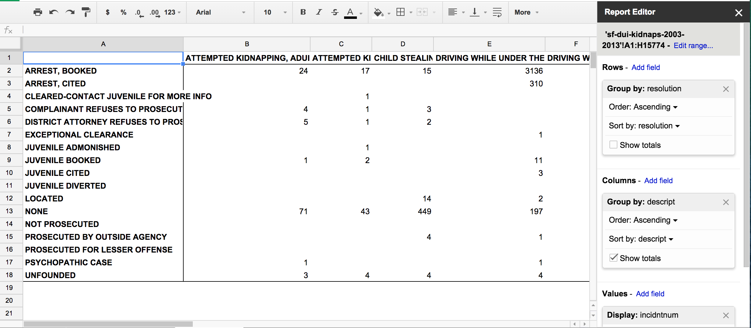
- Clear up the Report Editor by removing the existing fields in Rows and Values (i.e. start over)
- Then add
resolutionas a field to the Rows section. - Add a field to Values; again, it can be any of the columns, but switch the summarizing function to
COUNTA - In the Columns section, add the
descriptfield
The step-by-step video:
Now we have a straightforward table that lets us, at a glance, see how the various subcategories (i.e. descript) of crime incidents are resolved.
All together now
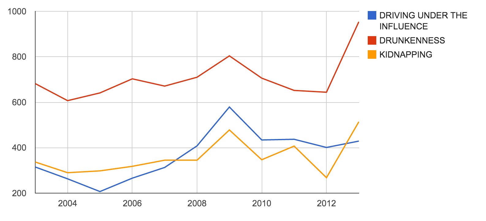
What we're really interested in are the chronological trends in the data: for example, are DUIs/kidnappings/etc going down or up over the years?
In the original data sheet, we have a date field. In order to pivot by year, we create a new column (let's call it year to keep it simple) and then derive the year from the date field with a formula:
=YEAR(D2)
Here's a quick video snippet:
Pivot by year
Now make a new Pivot Table and:
- Group by
yearfor the Rows - Group by
categoryfor the Columns - Choose any column for
Valuesand do aCOUNTA - Make a chart
Here's a video of the entire process:
And here's a chart that can be produced from that pivot table:
Conclusion
Generally, we love it when datasets contain very detailed, granular records; e.g. every crime report for every year, rather than a total number of reports by year.
However, when we need to know totals by year (or by month, or by hour, etc.), Pivot Tables are among the fastest ways to produce those summaries and get a high-level overview of what a large dataset actually contains.